Screenshot: format.com
There are several benefits to building a modern wedding photography website. It makes your photography more attractive and can help you secure more bookings. Building one may sound difficult, but it doesn’t need to be. In this article I’m sharing the steps you can take to launch your online wedding photography portfolio.
In this article, we’re going to take you through all the core steps of making a modern wedding photography website. Our knowledge comes from experience of building several photography websites, as well as analyzing the websites of industry leading wedding photographers.
We’re going to cover choosing the right platform for your website, what to add to it and how to make sure your images make the biggest impact on potential clients. We’ll also look at how the detail you share impacts your chances of getting the gig.
Why Build A Modern Wedding Photography Website?
The design of your website says a lot about who you are as a creative and photographer. Having a modern website shows that you are up to speed with current design trends. A good design will be more pleasing on the eye and more likely to hold the attention of the viewer – more so than a dull, outdated design.
Modern Wedding Photography Website Builder
The best website builders for photographers make life easier. The likes of FORMAT and Squarespace have beautiful premade templates, many of which are built with wedding photographers in mind.
Most website builders come at different price points. FORMAT offers great value and is a solid option if you’re just starting to build your business and don’t have too many funds at your disposal. You can try it for yourself by enjoying a free 14-day trial when you sign up.
Squarespace is more costly, but it has some benefits. You can add beautiful online stores which are good for selling products, like wedding photography photo books. You can also add booking forms so clients can hire your services on a specific date.
FORMAT and Squarespace are two of the front runners in the website building space, but there are more. Below is a list of our favorites.
-
FORMAT
-
Squarespace
-
Pixpa
-
22Slides
-
Pixieset
If you want an all in experience, it’s worth checking out 22Slides. They can help with custom designs, SEO, copywriting and more. They’re becoming a popular force in the photography community so it’s worth taking a look.
Modern Wedding Photography Templates

Screenshot: format.com
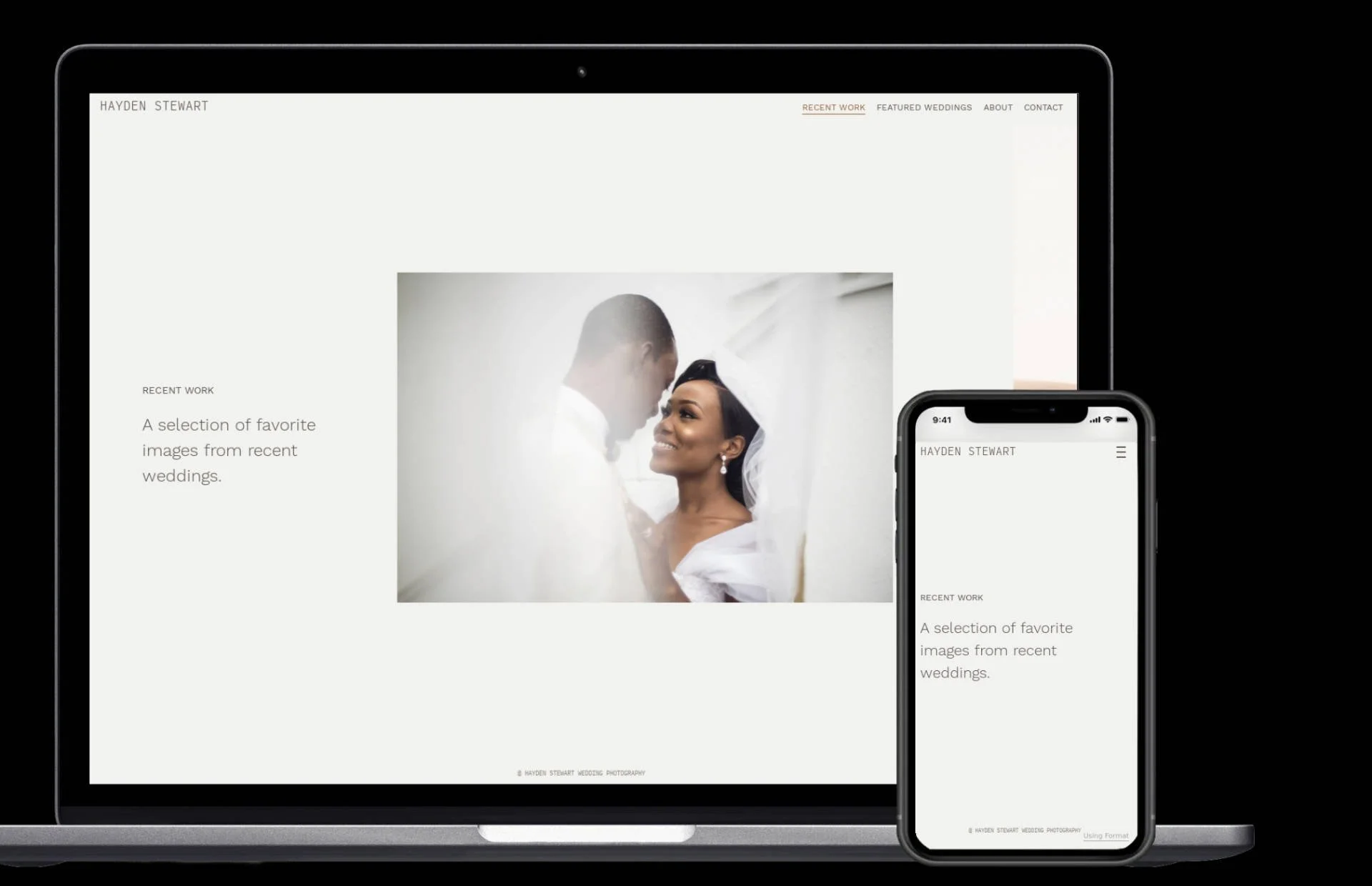
Once you’ve settled on a website builder, it’s time to choose a template. Modern wedding photography templates come in all shapes and sizes. Something to consider before selecting a template is which one gives power to the most important element, your photographs.
Some templates only show one image at a time. We would refrain from choosing this type of template. That’s because you’re only giving yourself one shot at impressing your audience. If you select a gallery that shows a few images at once, then you have a better chance of capturing the attention of potential clients.
It’s become cliche in the design space, but you’re going to want to choose a template that’s clean and minimal. If you overload your design it can be distracting – this is a classic case of less is more.
Color Schemes
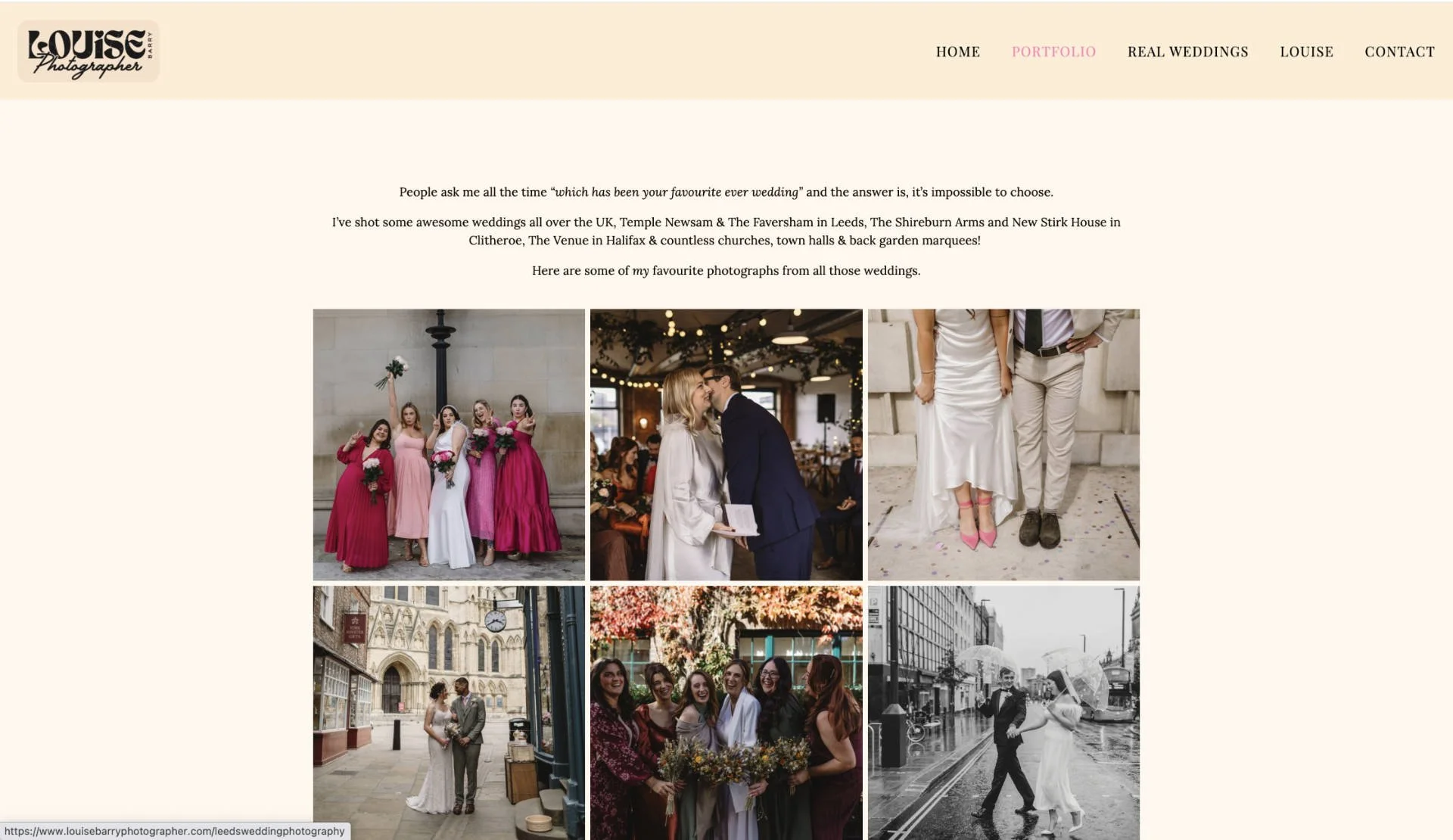
Screenshot: louisebarryphotographer.com
Choosing color schemes may feel overwhelming, but it’s actually quite simple, especially for wedding photography.
What’s the first color you think of when you think of a wedding? White. And, people prefer to marry in warmer times of the year. When choosing your colors we suggest making white the center point of the design. Your page design should have warm colors, preferably a warm yellow. Adding a little blue works too, as it offers balance alongside the warmer colors.
For copy, we would stick to black. Many believe black copy and a white background is easier to read and process – keep that in mind when blogging, which we will get onto shortly.
Fonts
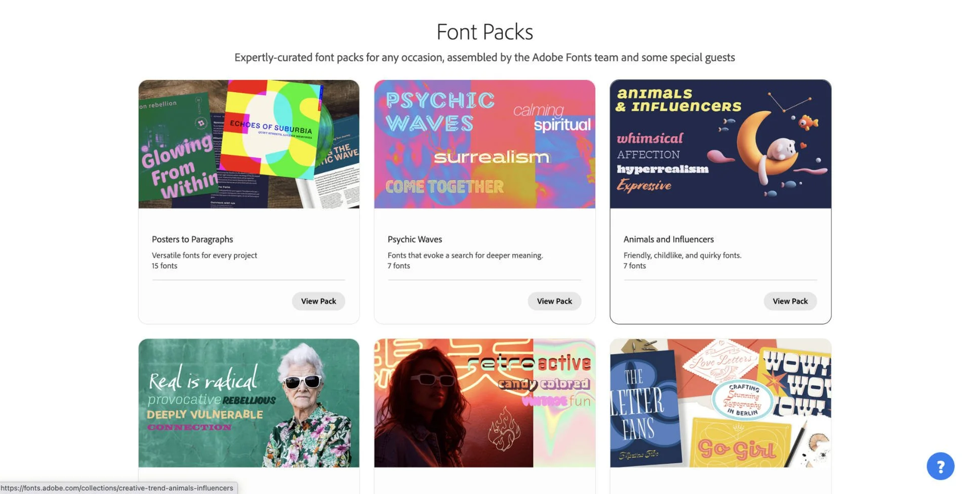
Adobe Fonts
At times, photographers can become overly fancy with their fonts. It may seem like a good thing, but in fact it creates a problem. Fonts that look like they were made with a fountain pen may feel classy, but they’re quite difficult to read. The harder it is to find important information relating to your wedding photography business, the more likely people will click off your website.
Part of building a modern photography website is keeping things clean and simple. This means selecting easy to read fonts. Serif fonts are great because they have that air of class about them, while still being clean enough to easily digest.
You can experiment with different fronts for your Headings and mix them with other fonts for your main copy. You can play around with different options and find plenty of templates for free on Adobe fonts.
Modern Wedding Photography Website Sections
Your website will have different sections, and the rule here is to have no more than you truly need. The last thing you want to have is a website that is a click fest and hard for the every day visitor to navigate.
These are the sections we would include in your wedding photography website…
-
Home page: This should display your flagship images and an overview of who you are. It’s also a good spot to share some client testimonials.
-
Galleries: A dedicated page that shows your different wedding photography galleries. You can divide them and add a cover image for each portfolio.
-
About me: A section to share more about who you are and your motivations to do wedding photography.
-
Booking form: You space to list your different pricing options and a booking form. You can embed a calendar widget too so people are aware of your availability.
-
Blog: It’s worth having a blog to drive organic traffic to your website.
Selecting Your Photographs
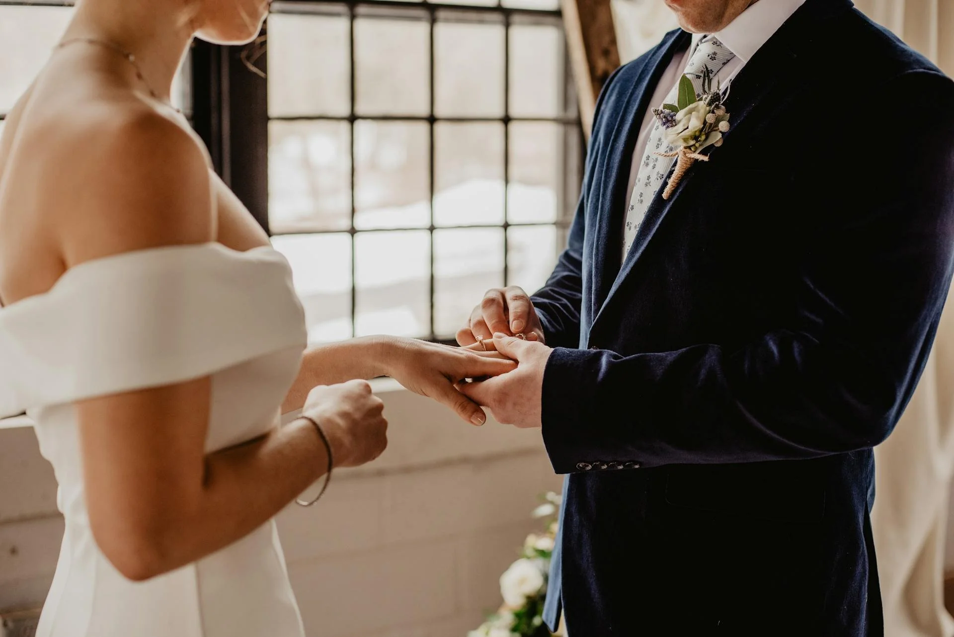
Photo by Emma Bauso
One of the most challenging parts of building your website is deciding which photographs to display…
Top tip, make sure the first thing people see when they land on your website is your photography. Too many pages have an About Me section as their landing page. Remember, you’re selling your photography skills first and foremost and you want to grip people by impressing them with your work – the rest can come later.
We advise not to add too many images. You don’t want to overwhelm people. Our recommendation is to upload no more than 10 images to five different wedding galleries you have shot. Have a range of styles too. Include any pre and post wedding photos, during the event and behind the scenes shots, because that candid look is becoming increasingly popular.
By only showcasing your gold star photographs, you leave no room for disappointment. The more you show, the more opportunities you give people to decide to go elsewhere.
Should You List Your Prices?
Listing prices is a polarizing topic. Some believe it’s best to get potential clients on a call so you can charm them before agreeing a fee. Personally, I think the world is changing and it’s best to give the information people want as quickly as possible. The truth is, people can either afford your service or they can’t, wasting time on calls won’t change that.
List your prices for photographing the event. You can always upsell products once you meet, like bespoke photo books for the happy couple or single prints with framing. You can also tier your pricing and give people options. This ensures you don’t price out everyone on lower budgets, and you still offer a premium package for those that can splash the cash.
Your About Me Page
Your about me page is your chance to let your personality shine. It’s the best way to let people know more about the person behind the photographs. It’s also the first step of building rapport with potential clients.
Here are some tips…
-
Speak in first person: People want to know it’s you who is speaking to them, not some bio written by a ghost writer.
-
Tell a story: You don’t need to write a novel, but do give people an idea of why you fell in love with wedding photography.
-
Excite them: Explain to people what you want to achieve through your photography in a way that excites them. “I’m passionate about giving people an eternal memory of the most romantic day of their life…” being an example.
-
Perfect length: Write too much and people will get bored. Write too little and they wont connect to you. Keep your about me to around 5-7 paragraphs.
-
Call to action: Sign off by encouraging them to get in touch and make a booking.
Consider Blogging…
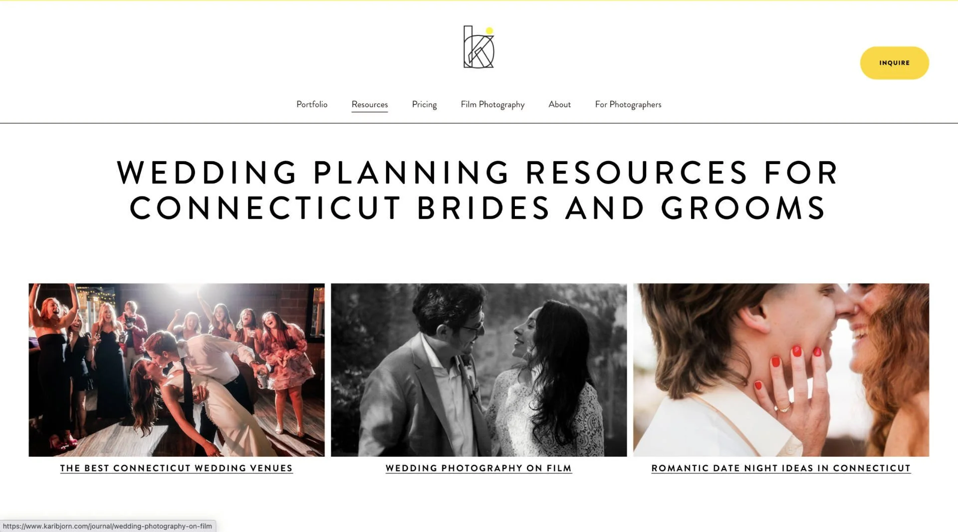
Screenshot: karibjorn.com
Blogging is still an effective way to drive traffic to your website. The problem with sharing links to your website on social media is that those sites don’t want people to leave. When you share a link to the likes of Facebook and Instagram, these platforms throttle down your reach.
If you learn some basic SEO you can get eyes on your site organically. The term “wedding photographer NYC” gets around 1000 unique searches per month. Learn to write well structured content relating to that keyword and you have the potential to attract a lot of people to your website. It’s free traffic too, so plenty of opportunities for profit.
Keep in mind, you must be consistent with your wedding photography blog. Not every day, but at least once a week. It must stick to your niche too. There’s no point writing about your safari adventure if you want potential wedding photography clients.
Inspiration
Now we will share some of our favorite examples of a beautiful, modern wedding photography website. They are home to some of the best wedding photographers, so you can also take some inspiration from their work.
Phoebe Jane

Phoebe Jane is a wedding photographer in the UK. She’s built a wonderfully elegant wedding photography site that ticks all the right boxes. Jane puts her strongest work first and ensures her potential clients only see the best of the best. We really like the color palette she has chosen, as we feel it gives her portfolio the sophistication needed to attract future bookings.
Sweet Alice Photographer
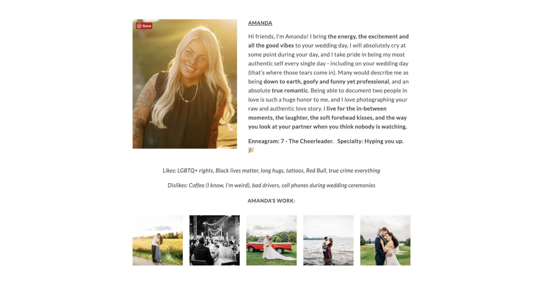
Alice and Amanda are a photography duo located in Hudson Valley. We love their body of work, but the core reason we included them is due to their About Me page. They have kept it concise enough to ensure people don’t lose interest, and added enough detail to grip their attention. It’s the human element we love the most. It doesn’t feel “corporate” but instead, heartfelt.
Here’s a passage we liked and that can help give you inspiration when creating your modern wedding photography website…
“I live for the in-between moments, the laughter, the soft forehead kisses, and the way you look at your partner when you think nobody is watching…”
Leila Brewster

Leila Brewster is a wedding photographer in NYC. We adore the large full-bleed images that welcome us as we land on her page. There’s no room for anything else, just her top-tier wedding photography. Take note of the simplicity in how she presents her portfolio. There are no distractions, just a clean modern style, allowing her work to take center stage.
Signing Off
That’s it from this guide on building your wedding photography portfolio. When it comes to design, there’s always the option to build it from scratch. But, if you don’t have the resources to do so, a good website builder is your best move – again, we recommend using FORMAT as it’s specifically built for photographers.
Remember, this is just a guide. It’s important you find ways to put your personality on your site, as that’s what will help you stand out the most. If you need some inspiration, take a look at these incredible photography websites.
How did you build your wedding portfolio? Which site do you use to host your work? Let us know in the comments. Thanks for reading.
FAQs
What is the best photography website?
Popular website builders include FORMAT, SmugMug and Squarespace. They all offer beautiful templates to showcase your photography portfolio.
Want your work featured on Them Frames? Pitch us.
This article contains affiliate links. If you sign up using one of the links, Them Frames receives a commission which helps us keep the lights on.
